This is the first project that I have done for WeCloudData. The purpose of this project is to find the relationship between housing prices in Toronto(GTA) in relation to location, house size, number of bedrooms and number of bathrooms.
We start by scraping data from Kijiji through the URL requests.

Then we parse our data source by using Beautiful Soup.


After, we translate the raw data into the clean dataset. This is what the first five rows of our data looks like below:


Price represents housing prices in Toronto; postcode is the corresponding postcode; FSA is the first three letters of the postcode; bedroom is number of bedrooms in the house; bath represents the number of bathrooms in the house; sqrt means squared root of feet of the house; city is the location; while the house latitude and the longitude correspond.
As you can see, there is missing data, so the next step is to delete the outliers. We first find out the percentage of missing data in each feature. Besides sqrt other features only have few missing data. However, sqrt has more than 60 percent missing data. In this case, we think this variable(sqrt) is useless. Therefore, we forget about this variable and only delete other features missing from the data and just take the other features into account. Then our new dataset is below, we only see five rows here:


The next step is to find out the relationship between each feature, since we are not just putting the city into our account. Therefore, we decide to translate city into the mean price of the city, which means we translate the categorical variable into quantitative variables. After this is done, we can now draw a boxplot and delete the outliers. We first use SciPy to draw a box plot of the housing prices, then you can see a huge outlier there.


Then, we delete the outliers and use Plotly to draw a nicer box plot.


This is the box plot of the housing prices. As you can see, the minimum price is around 0, the maximum amount is approximately 1.6M, and the median is approximately 0.7M, and there aren’t outliers since we deleted them already. After that, we have also drawn the scatter plot for the housing prices.
Scatter Plot for Housing Prices


For the scatter plot above, the x-axis is the number of the house, the y-axis is the price of the house.
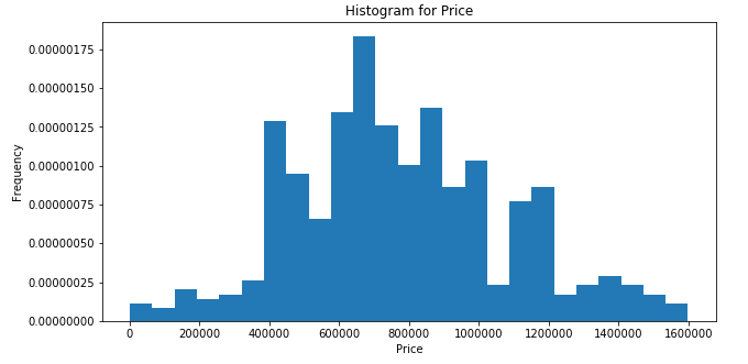

We also drew the histogram of the housing prices, as you can see the shape is almost normal. Then we have other descriptive statistics, such as a pie chart.


This is the pie chart of the number of bedrooms in those advertisements. As well as the pie chart of the number of bathrooms below:


We have also found out the bar chart for the number of bathrooms and number of bedrooms. The x-axis is the number and the y-axis is the housing prices in Toronto.
Bar Chart number of Bathroom
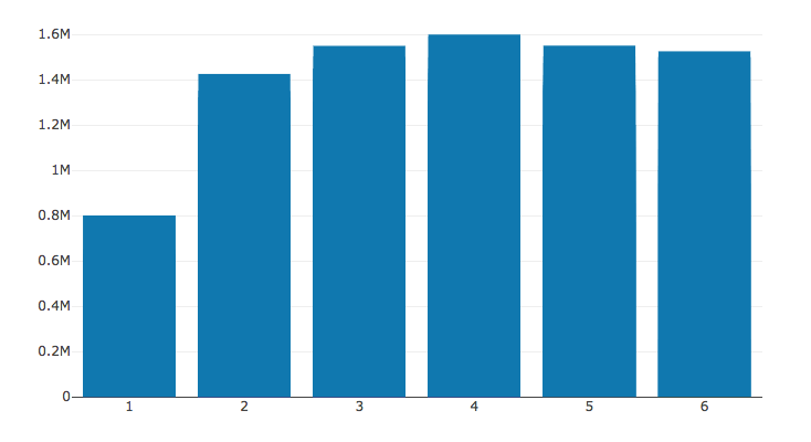

Bar Chart number of Bedroom


Then we draw the graph of the location of each advertisement since our project is mainly focused on Toronto. Then you can see most of the advertisements are located primarily in the larger areas of Toronto.


After that, we have also drawn the QQ plot of the housing prices to see whether it follows the normal distribution. And the answer is yes. Because most of the points are along the red line.


Then the last step is to find out the relationship between the housing prices and the other features, except for sqrt. We pick four regressions to compare and test: Linear Regression, Lasso Regression, SVM, and Decision Tree Regression. After, we use the cross-validation method to test those four regressions based on our data, we find out the unfortunate answer. The accuracy of all the models gave me terrible results, which means all of those models are not good. We have also drawn the Scatter Plot for comparing the test data and predict data for these four methods. The x-axis is the test housing price in Toronto and the y-axis is the predicted housing prices in Toronto. As you can see, they do not perform very well.


Scatter Plot of Quantitative Comparison


The reason for this result is we did not take sqrt into account. Because sqrt should not be one of the main reasons for determining housing prices. If we want to improve our results and obtain a reasonable conclusion, next time, we need to choose a more valuable website and scrape more features along with more data.
To see Manqiong’s original blog post please click here.
To find out more about the courses our students have taken to complete these projects and what you can learn from WeCloudData, click here to see our upcoming course schedule.
