The blog is posted by WeCloudData’s student Sneha Mehrin.
This Article Outlines the Key Steps in Creating a Highly Interactive Dashboard in Einstein Analytics by Connecting to Redshift.

This article is a part of the series and continuation from the previous article where we build a data warehouse in Redshift to store the streamed and processed data.
Let’s briefly review our pipeline and the schedule of the batch jobs that we developed.

We already covered the streaming and batch jobs in aws, now let’s move on to Einstein Analytics.
What is Einstein Analytics?
- Einstein Analytics is a cloud based analytics solution offered by Salesforce.
- The data is stored on its own platform, but because it is a Salesforce Product, it is well integrated with the Salesforce platform.
- The key advantage of Einstein Analytics is its own suite of data prep tools DataFlow and Recipes , which provides a lot of flexibility to the analytics developer.
Quick Overview on Data Pipeline in Einstein

- Einstein uses Data Sync to connect to external data sources and its own native Salesforce local objects.
- We can schedule the Data Sync to extract the data at a specified time.
- The data can be further cleaned, prepped and transformed using DataFlows and registered in the form of datasets which further gets used in Dashboards.
In our technical design, we are connecting EA to a a Redshift cluster using the Redshift Connector provided by EA and registering into a dataset using DataFlow.
Key Steps In this Process
Please note that this article is written keeping in mind that readers already have some idea of how to get started with Einstein.
- Configure the Redshift cluster details in EA.
- In the data manager, Go to the connect tab and click on Connect To Data.
- Add a connection and choose Redshift connector.
- Configure the details as mentioned in this article https://help.salesforce.com/articleView?id=bi_integrate_connectors_redshift_settings.htm&type=5
- Save and test the connection


2. Once the Connection is successful, select the table in Redshift cluster you created and the columns.


Step 3 :After this is done , go to the connect tab, your connections will show up. Click on Run Data Sync to sync the data.


Step 4 :Create a simple DataFlow using SFDC Digest as the amazon connection and use SFDC register to register the dataset.

Since, I already deleted the redshift cluster to avoid any costs, the nodes are showed with warning. However, the process remains the same.
Preview of the Dashboard
Dashboard has three main components
- Key KPI Metrics : This is controlled by the Date filter and users can toggle between different date filters.
- Metrics Over Time : This is a static visualisation showing the key KPI metrics over time in the current month.
- Comparison of Metrics Over time : This is also a static visualisation, however this gives a comparison of the metrics compared to last year.
Key Components of the Dashboard
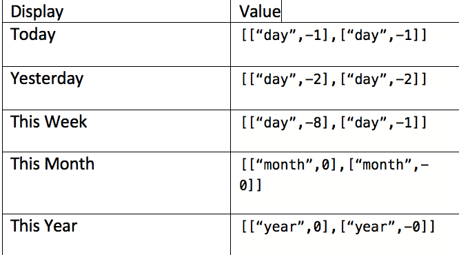
- Date Filter
- This is a static filter with the below values

2. Key KPI Metrics
These are compact number widgets with the static date filter binded to it in the filter section.
Logic behind this is quite simple; only additional configuration these visualisations have are the bindings.
New Questions : Unique(question_id)
Average Answer count : avg(answer_count)
Average View Count : avg(view_count)
Average Score : avg(view_score)
Here is the snippet of the bindings in the filter section encoded in the underlying json of the dashboard.

3. Line Charts
These visualisations do not have any bindings, but it has an additional metric such as % of growth in the tooltip.
Here is a quick video on how I configured these charts.
Since the visualisation can have only measure, the key tip is to create % of Growth using compare table and then hide it, so that the query projects it ,but it doesn’t render in the visualisation. You can then use the hidden measure in the tooltip
4. Line Charts Comparison
Since these charts are essentially a new query, I used pages to provide a seamless experience of navigating between the two views.
I used SAQL for the underlying query of these charts.
Here is a quick video on how I configured this visualisation.
That’s all for this series!!
It was a true learning experience to build this pipeline. If you have any questions, please feel free to shoot me a message!!

